
I have already shown that ordinations of the Lake Żabińskie fossil assemblages are weirder than you ever imagined possible. Now it is time to look at figure 2 of Larocque-Tobler et al (2015) which shows an ordination of the chironomid assemblages in the modern Polish-Canadian calibration set with lakes colour-coded by temperature. A number of lakes are marked as “misplaced”, that is their temperature differs from neighbouring lakes in the ordination. This figure should be easy to replicate with the archived data.

Figure 1. Full published version of LT15 figure 2.
Before attempting to replicate this figure, I want to look at the history of this figure by examining the versions included in the manuscript that became LT15 (Disclosure: I was one of the reviewers). I understand that this could be viewed as a breach of peer review confidentiality, a policy designed to prevent harm to the authors “by premature disclosure of any or all of a manuscript’s details” (ICMJE, 2016). The duty of confidentiality is not without limitations: “Confidentiality may have to be breached” (ICMJE, 2016). In this case, since the final version of figure is published and there is no additional information in the review versions, I maintain that the duty of confidentiality was largely discharged on publication – this is not a “premature disclosure”. Further, I argue that my duty to expose possible issues with LT15 outweighs any residual duty of confidence1. I told QSR of my plans to publish this post: they did not object.
When I first reviewed LT15, circles encompassed groups of lakes that supposedly had the same temperatures.

Figure 2. A. Principal Component Analysis (PCA) of calibration set lakes. The lakes, separated by their chironomid assemblages, were grouped by their mean August air temperature (group 1, 3-11°C; group 2, 11-16°C; group 3, 16.3-17.4°C and group 4, 17.5-27.5°C). The plot of the species scores is identical in all versions of figure 2, so is omitted.
Note that the axes of a ordination should be the same scale, but are not in any version of figure 2. As with Supplementary Data Figure 1, this indicated that they were not plotted in CanoDraw or C2, but probably in something like Excel.
I doubted that each circle encompassed all lakes of the correct temperature and omitted all others as the figure implied. In my review I asked
Figure 2. The circles on this plot beg the reader to trust the author. Does each site within each circle fall within the temperature range given? If not, this figure is misleading.
To which the authors responded
Again, why would anyone not trust the author???? … We added the eleven “misplaced” lakes on the graph. The sentence “Of the 122 lakes, 11(9%) had a chironomid composition which did not correspond to those of lakes with similar mean August air temperature” was added.
From this response alone, I can think of eleven reasons not to trust the authors.
I also thought the percent of the variance assigned to the first (46%) and second (31%) axis was implausibly high for inevitably noisy community data.
Reformulated to: PCA Axis 1 explained 22.3% of the variance in the chironomid data and PCA Axis 2 explained 17.5%.
No explanation for this abuse of the verb “reformulate” was given.
The second review version of the manuscript had a new version of figure 2.

Figure 3. Second review version.
This figure should be identical to the original, except for the symbols showing which the “misplaced” lakes are (and which country each lake belongs to). Indeed it mostly is, but curiously, some lakes have moved position. One lake has vanished from the upper left quadrant, which is otherwise identical. The lower left quadrant is identical. The right hand side has both additions and deletions. I have no idea what is going on here. It cannot be a change in the data transformation used as that would affect all lakes (and the species scores) as would alterations to the data.
Now compare the second version of figure 2 with the published version.
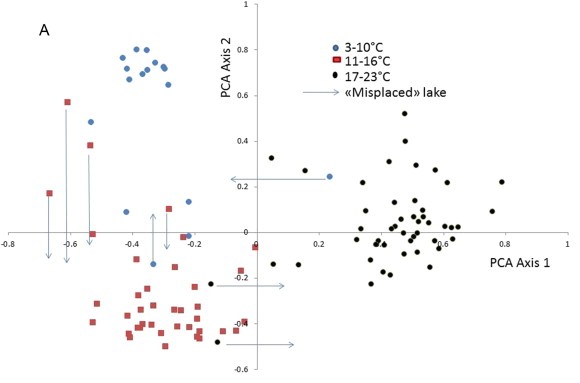
Figure 4. Published version.
Now there are arrows to show where each lake should belong, and a different temperature scale which only extends to 23°C whereas the paper reports lakes as warm as 27.5°C. Where are the four lakes warmer than 23°C? And why are there only 103 lakes not 121? Where are the missing 18 lakes?
The location of lakes in the ordination should be exactly the same as the previous versions. Most lakes are in the same position, but the lower right quadrant is missing a cluster of several lakes, and the upper left quadrant is greatly thinned.
There are now only eight lakes marked as being misplaced. Strangely, six of these eight misplaced were not marked as misplaced in the second review version. Indeed, why would anyone not trust the author?
But what of the archived data? Can any version of figure 2 be replicated? Remember, the figure shows a PCA so it should be possible to reproduce the figure exactly (with the exception that mirror images are possible).
A principal component analysis of square-root transformed species data generates an ordination that looks very similar those shown above. In the figures below, I’ve inverted both axes so they match the published figures.
It is not clear how the temperature scale has been cut into levels for the published figure. What happens to points between 10 and 11°C or between 16 and 17°C? I’ve done my best.
library("vegan")
library("ggvegan")
keep <- colSums(spp > 0) >= 3 #Eukiefferiella fittkaui is included

pca <- rda(sqrt(spp[, keep]))

fpca <- fortify(pca, display = "sites", scaling = 1)

lab <- labs(x = "PCA1", y = "PCA2", colour = "Temperature °C")
cols <- scale_colour_manual(values = c("skyblue", "salmon", "black", "green"))

#temperature cuts to match version 2
fpca$temp <- cut(env, breaks = c(3, 11, 16, 17.4, 27.5), include.lowest = TRUE)
fpca$country <- c(rep("Poland", 48), rep("Canada", 73))

g <- ggplot(fpca, aes(-Dim1, -Dim2, colour = temp, shape= country)) +
geom_point(size = 2) +
coord_equal() +lab + cols +
geom_vline(xintercept = 0) +
geom_hline(yintercept = 0)

print(g)

Figure 5. Attempt to replicate review versions of figure 2
The arrangement of lakes in the ordination greatly resembles the first review version of the analysis with the exception that all the lakes above 23°C (which all lie in or close to the left side of the figure) are not to be found in the first version, and the cluster of lakes on the lower right in the first review version does not exist in the replication.
Some of the lakes marked as misplaced in the second review version, especially those in the lower left quadrant, actually have the expected temperature. Curiously, some of the lakes marked as being Canadian in the review copy are actually Polish. As with issues with Supplementary Data Figure 1, this acts to make the Polish and Canadian assemblages appear to be more similar than the really are.
The widespread mixing of lakes of different temperature classes means the implicit claim that there is a clean separation of lakes into different temperature classes demarcated by circles is misleading.
#Find missing lakes
#plot(-fpca$Dim1, -fpca$Dim2)
#abline(v = 0, h = 0)
#missing <- identify(-fpca$Dim1, -fpca$Dim2)
missing <-  c(3, 48, 66, 67, 68, 69, 70, 71, 72, 73, 114, 115, 116, 117, 118, 119, 120, 121)

#temperature cuts to match published version
fpca$temp <- cut(env, breaks = c(3, 11, 16, 23, 28), include.lowest = TRUE)
g %+% fpca +
geom_point(data = fpca[missing, ], colour = "red", pch = 21, size = 3)

Figure 6. Attempt to replicate published version of figure 2. Lakes enclosed by a red circle have been omitted from the published figure.
The arrangement of lakes also greatly resembles the published figure, with the major exception that the cluster of lakes on the upper far left has been greatly thinned and the lakes above 23°C omitted. Some of the misplaced lakes have arrows attached, others are omitted. Omitting misplaced lakes makes the relationship between chironomid assemblages and temperature appear stronger than can be justified by the data.
The amount of variance explained by the first two axes is considerably lower than that claimed by LT15.
PCA Axis 1 explained 22.3% of the variance in the chironomid data and PCA Axis 2 explained 17.5%.
pc <- pca$CA$eig[1:2] / pca$tot.chi * 100
round(pc, 1)
##  PC1  PC2
## 16.8 11.4
The question arises as to whether the lakes were deleted before or after the ordination was run. This can be tested by running the ordination on the data without the missing lakes.
pca2 <- rda(sqrt(spp[-missing, keep]))
fpca2 <- fortify(pca2, display = "sites", scaling = 1)

#data cuts to match version 2
fpca2$temp <- cut(env[-missing], breaks = c(3, 11, 16, 17.4, 27.5), include.lowest = TRUE)

g <- ggplot(fpca2, aes(-Dim1, -Dim2, colour = temp)) +
geom_point() +
coord_equal() +lab + cols +
geom_vline(xintercept = 0) +
geom_hline(yintercept = 0)
print(g)
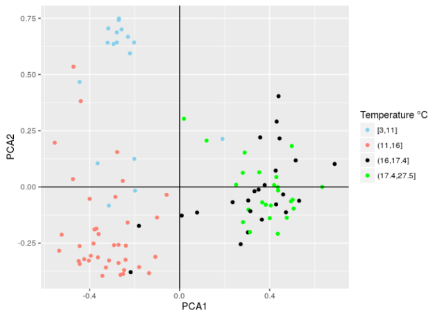
Figure 7. PCA with missing lakes deleted prior to running the ordination.
While this figure is similar to the published figure, the configuration of lakes in the ordination of the full dataset is a much better match, so it appears that the lakes were lost after the ordination was run.
LT15 figure 2 cannot be replicated (neither by me nor the authors). My evaluation of the different versions of this figure and my attempt at reanalysis hints that the analysis may have been tampered with, omitting lakes that did not fit the narrative of “chironomids = temperature”.
If we consider the implausibly precise reconstruction, the false claim that counts were all at least 50 chironomids, the data that evolved into impossible non-integer counts, the weird ordinations, the failed reconstruction diagnostics, the missing rare taxa and now a possibly tweaked ordination, it becomes clear that the question
why would anyone not trust the author????
has many, many answers.
I have been assured by someone who ought to care about the wandering/disappearing lakes, that figure 2
does not amount to prima facie evidence of data fabrication2 … Other explanations are equally possible, if not more so.
What these other explanations might be was left to my imagination, which rapidly conjured time-travelling sub-aquatic arachnids devouring the chironomids, and thereby changing the ordinations. Discounting these manifestations, I suppose my correspondent was obliquely suggesting that the three erroneous versions of figure 2 are the result of a succession of errors (nearly all of which happen to make the relationship between chironomids and temperature appear stronger than it is).
The errors in figure 2, and Supplementary Data Figure 1, are the direct result of the odd choice to use Excel for plotting, with the attendant (but minimal) risk of copy-paste errors between CANOCO and Excel. This risk would have been avoided entirely by using CanoDraw, which the authors have used previously (see Fig 4 in Larocque et al 2001: JoPL).
Wise counsel enjoins us never to attribute to malice that which is adequately explained by negligence. And everybody makes mistakes: I hope the errors in my papers are neither numerous nor critical. It is not my role to determine how the errors, inconsistencies and improbable results in LT15 came to be. Others have this task of determining whether the results in LT15 are the result of extreme good luck and sloppiness, or something else.
But what I know is this: LT15 is not credible. And, whatever the cause of the problems in LT15, I would read all of the first author’s papers with a certain amount of caution.
 @richardjtelford

A few weeks ago while tinkering with your analogue matching blogpost I found lakes in this Polish dataset equalling more than 100%. Seems to me an issue where a formula to calculate relative abundance was reading from a wrong column (from the data that is currently posted at any rate), perhaps this is the reason some of the lakes are moving about?
Pingback: Reproducibility of high resolution reconstruction – one year on | Musings on Quantitative Palaeoecology